How to read P&L Charts (part 1)
The question considered in this article might seem too obvious, and one might say that there is nothing to discuss. But our user support experience tells us that often people who are entirely new in options spent excessive time on trying to figure out options payoff profiles. Having a well-developed skill of reading options risk profiles (alternative terms are P&L profiles, payoff function profiles) is essential to successful options trading.
For sure, sooner or later everyone will understand all the details, but we think that with this article we may accelerate this process.
P&L of a position in a linear asset. Numbers.
First, we assume stocks, bonds, indexes, commodities, ETFs and even futures are all linear assets. They all (except futures) have their “own price,” which doesn’t directly (formally) depend on any other asset. Futures price depends on its underlying asset price in a linear way, thus we also assume futures as a linear instrument.
Assume you have $100 in cash. You then decide to buy a stock with a current price of $100. Therefore, your portfolio will consist of 1 share, and you will be glued to computer/smartphone monitoring the price of the stock. What you are doing is simple and straightforward. You just observe the price, and since you have only one share, you know that the value of your portfolio entirely coincides with the stock price. Then you simply compare the current value of the portfolio with your initial investment ($100) to calculate your P&L.
Putting the numbers on a chart
Now let’s put the example above on a chart. Let’s take a look at figure 1. The x-axis is the per share price. The y-axis denotes our portfolio P&L The chart we are going to build shows the relationship between the P&L and the stock price.
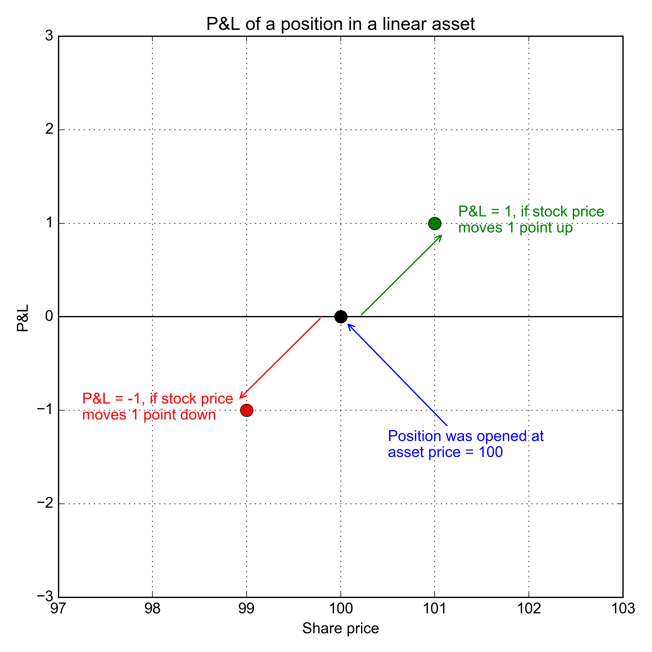
The blue point corresponds to the very moment when we’ve just bought the share. Price at that moment is $100, and therefore the P&L is zero.
If the price moves from $100 to $101, then our portfolio will be worth $1 more than the initial cash amount; thus, the P&L is $1. The green dot on figure 1 corresponds to this scenario. Its coordinates on the plot are $(x;y) = (101;1)$.
On the other hand, if the price goes down to $99, then the P&L will be -$1; the red dot on the figure corresponds to this scenario, its coordinates are $(99;-1)$.
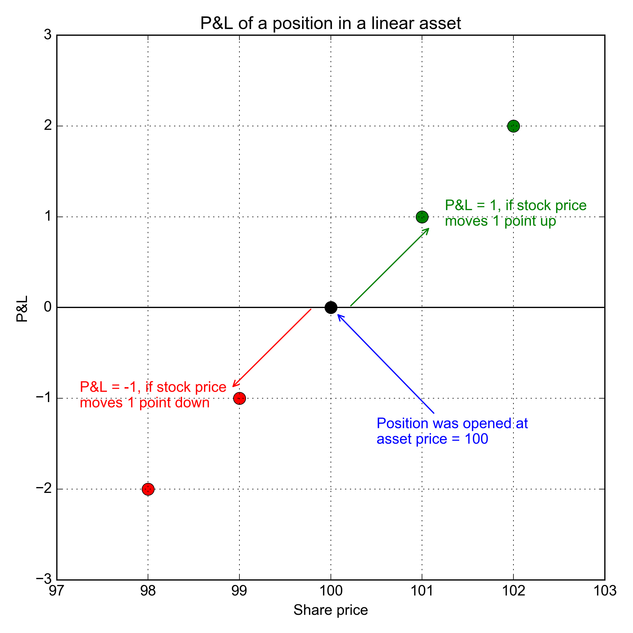
Similarly, with a bigger price move of let’s say, $2 instead of $1, we can see that On figure 2, the stock price changes to $102 (green dot) or $98 (red dot).
Moving onto figure 3, we see that all the points are lying on a straight line. No matter how much the share price changes, the P&L points on the chart will always be lying on this line.
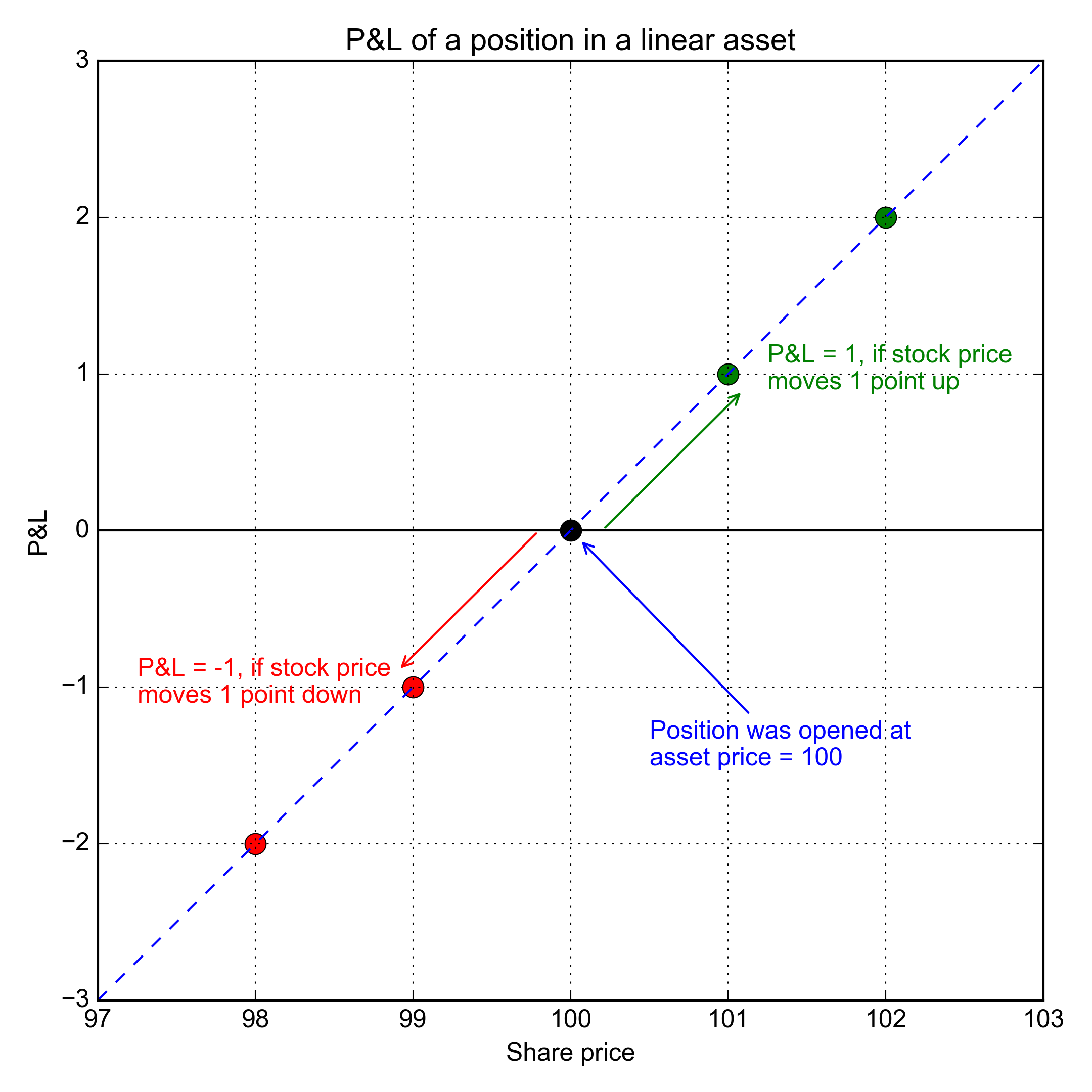
This means that P&L has a linear relationship with the price. In teenager math form, this would be $y = Qx$, where $y$ is the P&L of the portfolio, $x$ is the stock price change, $Q$ is the number of shares
The P&L of the portfolio is the number of shares multiplied by the P&L of a single share. Therefore, we can substitute $p - p_0$ for $x$, where $p_0$ is the purchase price (for a long position) and $p$ is the current stock price. We can now rewrite the formula as:
$y = Qx = Q (p - p_0)$ (1)
This equation describes the direct dependence of the portfolio P&L on the share price.
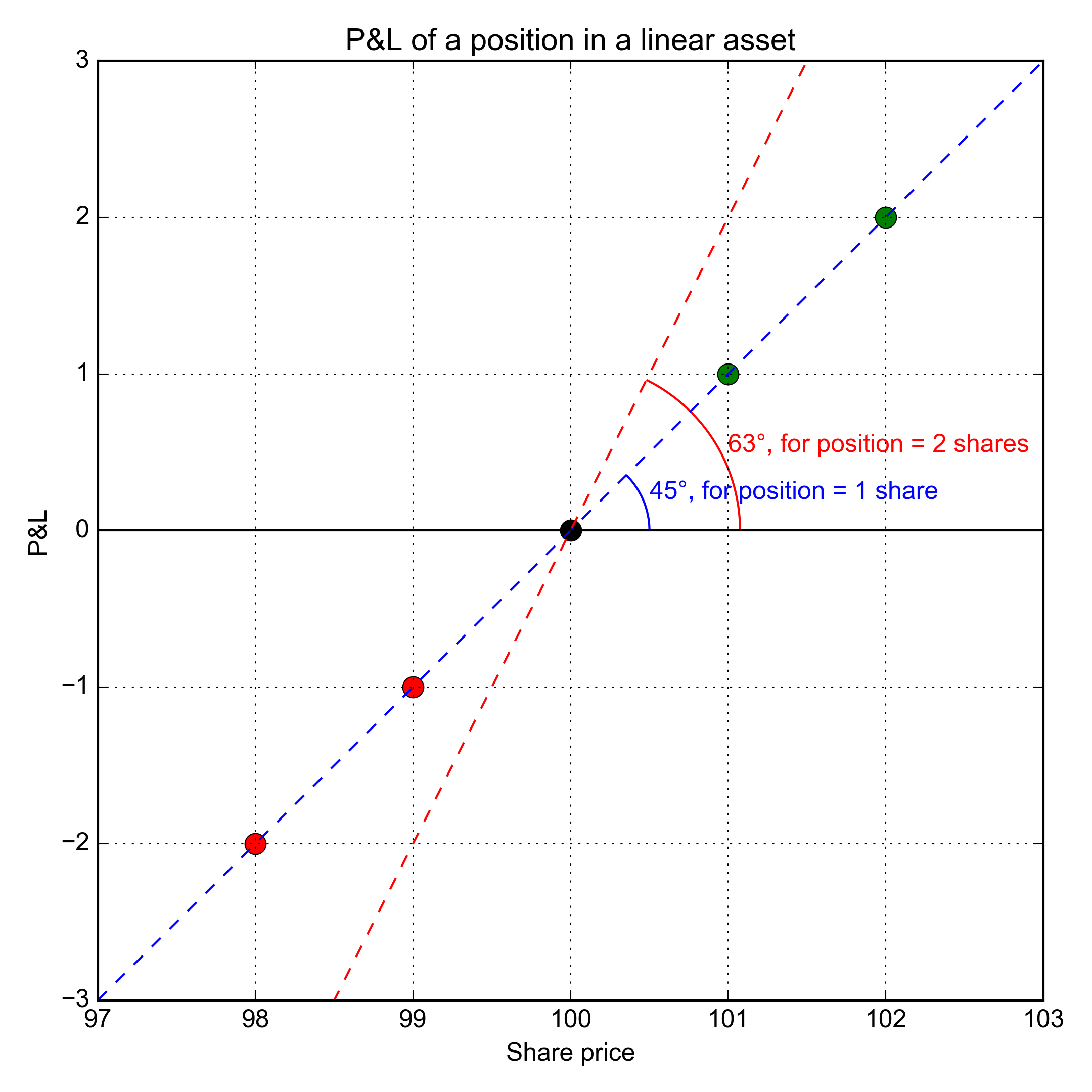
What if we own 2, 3, etc. shares? The $Q$ in the formula above will be $Q = 2$ or $ 3 $ so $y = 2(p - p_0), y = 3(p - p_0)$ and so on.
On figure 4, we’ve added the line corresponding to a portfolio of 2 shares. Note the angles between the P&L lines and the x-axis. The more shares in the portfolio, the bigger angle is, and the faster you earn or lose money. For 1 share, the portfolio P&L angle is 45 degrees, while for two shares, the angle is 63 degrees.
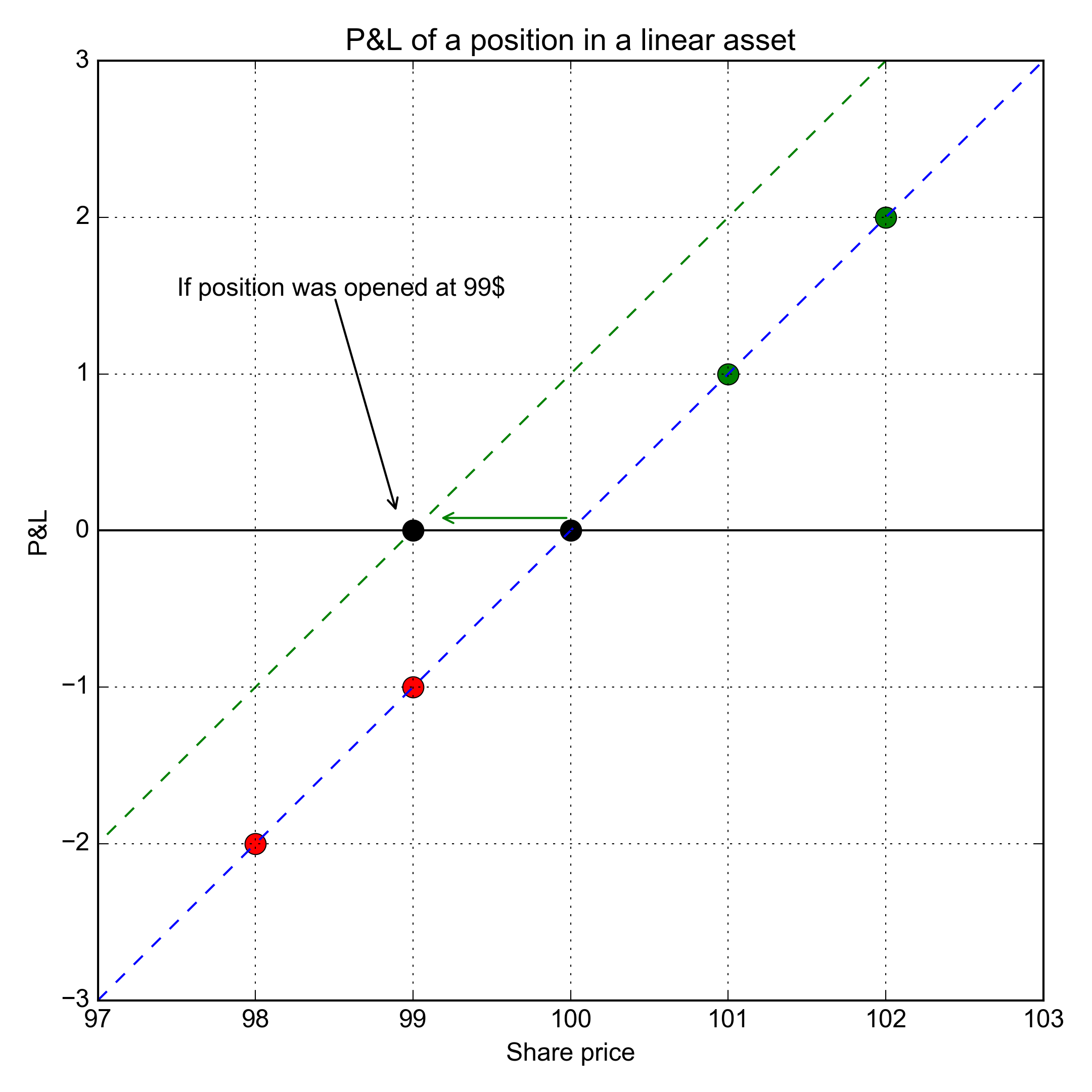
Changing the open price
In the example above, the stock was bought at $100. What would the chart look like if the position was purchased at $99? How do we redraw the P&L line? The line will be the same as before, just shifted to the left by 1, as shown in figure 5.
Closing the position
What if the stock price rose to $101 and the holder decided to sell it and close position? What will our chart look like then?
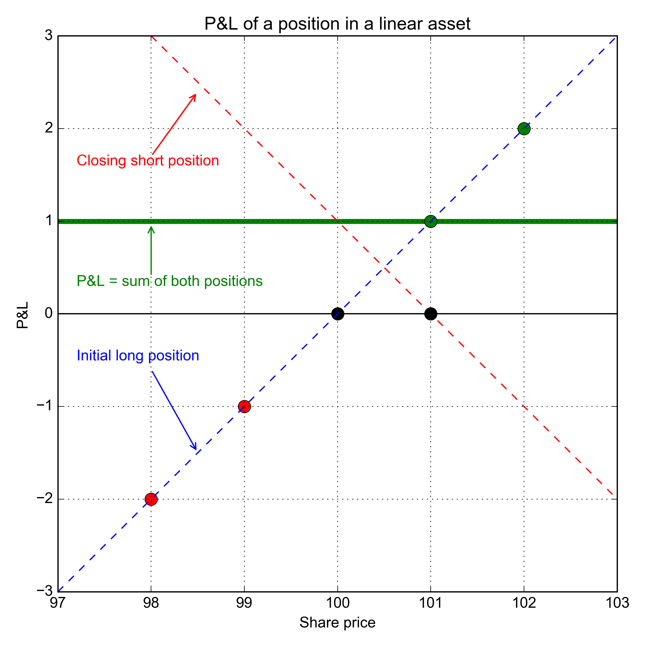
We can think of selling the position as a separate short position and draw them both on the chart (figure 6). When you buy and sell a security intraday, your broker actually keeps both positions separate. In effect, you own both the original long and the offsetting short – even though you only see cash. Only after the trades are settled and cleared, are these positions will be collapsed on your broker’s books.
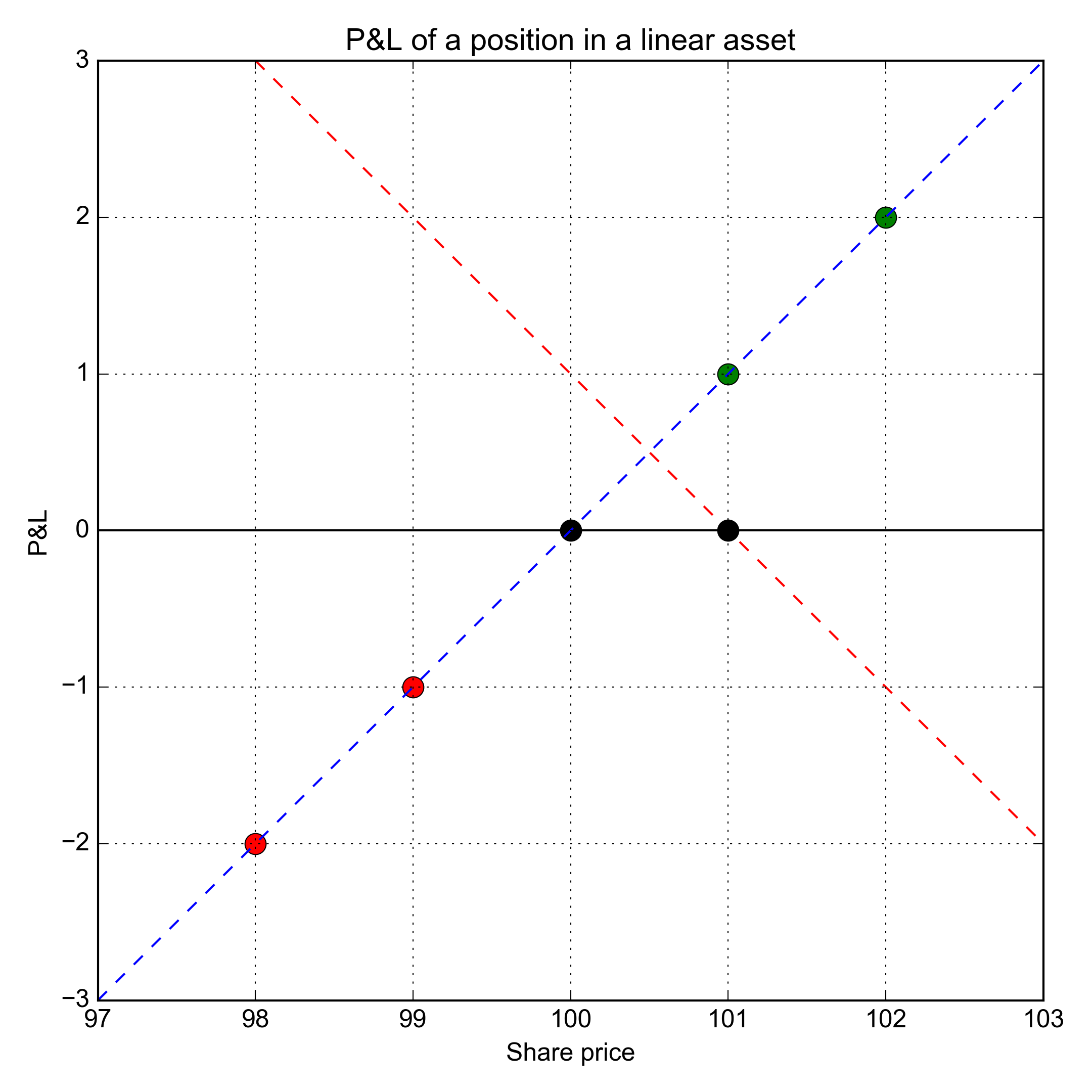
For a short position, the $Q$ in our equation (1) is negative, $Q = -1$. Thus, the P&L for a short position is $y = -1(p - p_0)$ and its chart is shown in figure 7. Since this is a short position, $p_0$ represents the sold price and $p$ still represents current price.
The total P&L of the portfolio, green line, is the sum of the red and blue dashed lines on the chart. Literally we need to sum red and blue lines at each point. The green line is, therefore, a constant, regardless of how the price changes going forward as the sum is always 1. The position is closed and we have a $1 profit in cash.
The beauty and usefulness of P&L charts are that you can quickly estimate your P&L no matter where price is going. You see the whole picture in one chart.
Examples considered in this article are simple, but using them, we’ve explained the basic principles of building P&L charts. Understanding these concepts will be essential when we explain more advanced options concepts in future articles.